
Colour drenching is one of the most exciting ways to transform an ordinary room into a beautifully cohesive and personality-filled space. Instead of painting just the walls, this decorating technique uses the same colour or closely related shades across multiple surfaces, including ceilings, doors, skirting boards, window frames and trim. The result is an immersive look that feels intentional, sophisticated and surprisingly inviting. Whether you love deep forest green, warm terracotta, dusty pink or dramatic navy, there is a colour-drenched style to suit almost every interior. This approach works particularly well in bedrooms, living rooms, dining areas and even smaller spaces where traditional decorating rules might suggest avoiding bold colours. The secret is choosing the right shade, balancing textures and considering how natural and artificial lighting affect the finished look. Explore these 19 colour drenched room ideas for inspiration on creating a beautifully coordinated home with walls, trim and ceilings that work together.
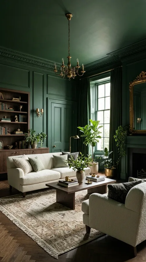
1. Deep Forest Green Colour Drenched Living Room
Bring the beauty of nature indoors with a living room completely wrapped in deep forest green. Paint the walls, ceiling, doors, skirting boards and window trim in the same rich shade to create an intimate, sophisticated atmosphere. This earthy colour works especially well in rooms with wooden flooring, vintage furniture and natural materials. Introduce cream upholstery, warm brass accents and textured cushions to prevent the space from feeling too dark. A large leafy plant or a few carefully chosen botanical prints can reinforce the organic character. For a layered finish, choose a matte wall paint and a slightly different sheen for the woodwork while keeping the colour consistent throughout the room.
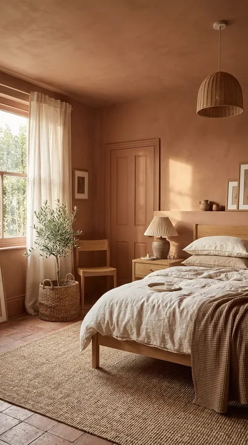
2. Warm Terracotta Colour Drenched Bedroom
Terracotta is a beautiful choice for anyone who wants a bedroom that feels warm, relaxed and full of character. Cover the walls, ceiling, doors and trim in a muted clay shade to create an enveloping environment inspired by Mediterranean interiors. The colour looks particularly attractive alongside linen bedding, natural oak furniture and woven accessories. Add soft ivory curtains and textured rugs to introduce contrast without breaking the overall colour scheme. If your bedroom receives plenty of natural light, a deeper terracotta can create a rich, sunbaked appearance. In darker rooms, consider a lighter dusty clay tone that maintains warmth without making the space feel overly enclosed.
3. Dusty Pink Colour Drenched Room
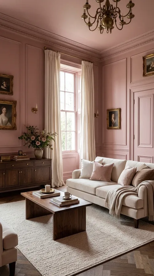
Dusty pink offers a sophisticated alternative to brighter pink decorating schemes. Its muted undertones make it suitable for bedrooms, dressing rooms, reading corners and elegant living spaces. Paint the walls, ceiling, skirting boards and door frames in one consistent shade for a seamless appearance. To keep the room from looking overly sweet, combine pink surfaces with dark walnut furniture, antique brass hardware and cream textiles. Velvet upholstery and linen curtains introduce additional texture while maintaining a soft atmosphere. A dusty rose shade with beige or brown undertones can also make a room feel warmer, especially when paired with warm-white lighting and natural decorative materials.
4. Moody Navy Blue Walls, Ceiling and Trim
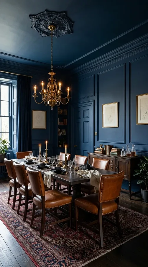
A navy colour-drenched room creates instant drama while maintaining a timeless, elegant appearance. Applying the same deep blue to the walls, ceiling, doors and architectural trim removes visual interruptions and makes the entire space feel thoughtfully designed. This approach works particularly well in home offices, dining rooms and cosy sitting areas. Add cognac leather chairs, dark wooden furniture or warm brass lighting to bring richness to the palette. If you want to introduce a lighter element, use ivory cushions, pale artwork or a natural fibre rug. Navy is especially striking in rooms with traditional mouldings, where the continuous colour highlights architectural details without making them visually distracting.
5. Soft Sage Green Colour Drenched Space
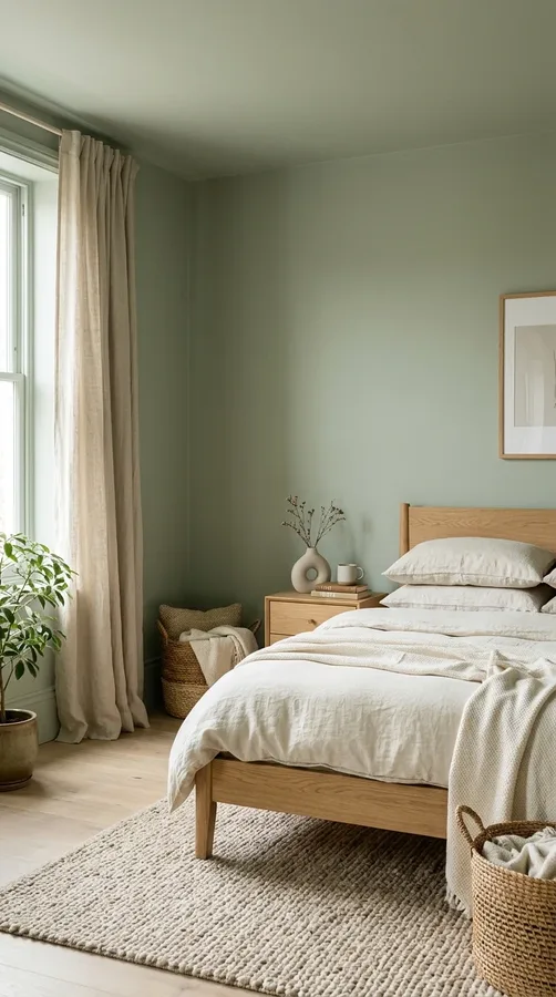
For a calmer and more understated interpretation of colour drenching, choose soft sage green. This versatile shade combines gentle grey undertones with natural green, making it ideal for bedrooms, bathrooms and relaxed living rooms. Apply it across walls, ceilings, doors and trim to establish a peaceful, unified backdrop. Pair the colour with light oak furniture, cream bedding, woven baskets and ceramic accessories. These natural materials create depth while keeping the room fresh and inviting. Sage green also works beautifully with warm-white lighting and linen window treatments. If you prefer subtle variation, use the same paint colour in different finishes rather than introducing an entirely different shade.
6. Chocolate Brown Colour Drenched Living Space
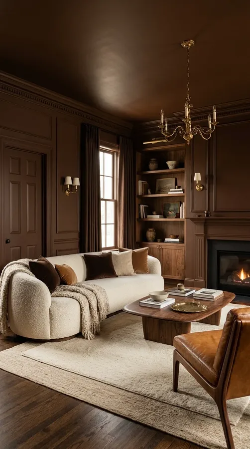
Chocolate brown is perfect for creating a luxurious, cocoon-like living room with plenty of warmth. Use a rich cocoa or espresso shade on the walls, ceiling, doors and trim to establish a continuous backdrop. This deeper palette looks especially beautiful with cream boucle seating, caramel leather, walnut furniture and antique brass details. Layer different materials to stop the room from feeling flat, incorporating velvet cushions, wool throws and textured rugs. Large mirrors can help reflect available light, while carefully positioned table lamps create a welcoming evening atmosphere. If you are hesitant about very dark brown, try a softer mocha shade that still delivers the richness of colour drenching.
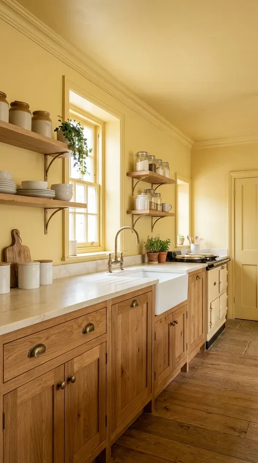
7. Butter Yellow Colour Drenched Kitchen
Give your kitchen a cheerful personality with a warm butter yellow colour scheme. Extend the shade across the walls, ceiling, door frames and surrounding trim for a cohesive appearance that feels bright without becoming overwhelming. This soft yellow works particularly well with natural timber cabinetry, creamy countertops and traditional brass fixtures. Consider painting the kitchen’s architectural details in the same colour to make the space feel more connected. White ceramic accessories and striped linen towels can introduce gentle contrast, while wooden shelves provide practical storage and warmth. For the best result, choose a muted yellow with creamy undertones rather than an intense primary yellow.
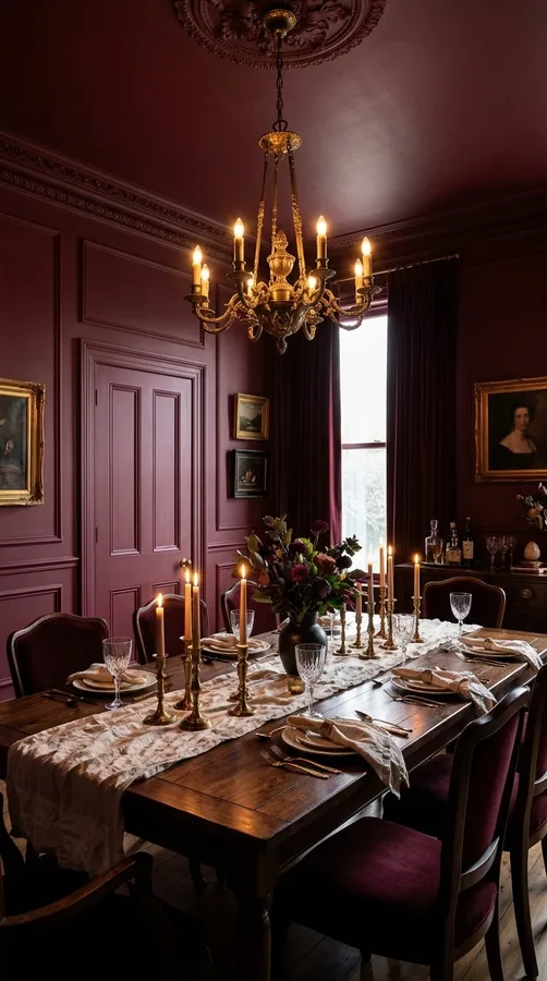
8. Burgundy Colour Drenched Dining Room
Burgundy creates a dramatic dining room that feels intimate, elegant and ideal for entertaining. Paint the walls, ceiling, doors and decorative mouldings in a deep wine-inspired shade to create a rich backdrop for shared meals. Dark timber dining furniture, antique brass chandeliers and upholstered chairs complement this colour beautifully. You can also introduce cream table linens, glass accessories and warm candlelight to soften the overall appearance. Burgundy works particularly well in traditional dining rooms with panelled walls, but it can also add personality to contemporary spaces. If the room has limited natural light, consider a slightly muted berry shade instead of an almost-black wine colour.
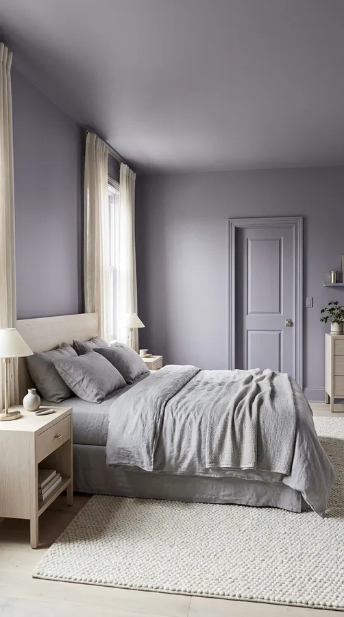
9. Lavender Colour Drenched Bedroom
Lavender is an excellent option for creating a bedroom that feels gentle, distinctive and relaxing. Choose a muted lavender or smoky lilac and apply it consistently to the walls, ceiling, trim and doors. This creates an immersive atmosphere without relying on multiple competing colours. Pair the shade with soft grey bedding, pale wood furniture and brushed silver or champagne metal accents. Cream curtains and textured white rugs can help brighten the room while preserving its peaceful character. For a more contemporary finish, select a lavender with grey undertones rather than a pastel purple. Layered bedside lighting will also help reveal the colour’s subtle variations throughout the evening.
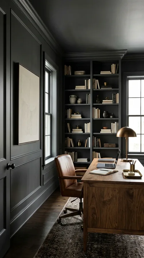
10. Charcoal Grey Colour Drenched Home Office
Transform a home office into a focused, sophisticated workspace with charcoal grey colour drenching. Cover the walls, ceiling, skirting boards and door frames in a balanced charcoal shade to create a polished environment with fewer visual distractions. A wooden desk, leather office chair and warm metallic desk lamp add contrast and prevent the space from appearing cold. Consider built-in bookshelves painted in the same colour to create a seamless, custom-designed appearance. Artwork with muted beige or cream tones can introduce personality without overwhelming the palette. Make sure the workspace has sufficient task lighting, especially if the room has small windows or receives limited natural daylight.
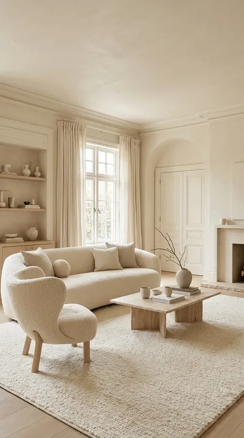
11. Cream-on-Cream Colour Drenched Interior
Colour drenching does not have to involve dramatic or saturated shades. A cream-on-cream scheme creates a beautifully understated interior that feels bright, timeless and effortlessly elegant. Use a warm cream across the walls, ceiling, doors, skirting boards and window trim for a consistent finish. The secret to making this neutral palette interesting is introducing plenty of texture. Combine boucle furniture, linen curtains, wool rugs, natural stone and light timber accents. You can also use different paint sheens to create subtle definition between architectural surfaces. Choose a creamy shade with warm undertones to avoid a clinical appearance, particularly in rooms with cool natural light.
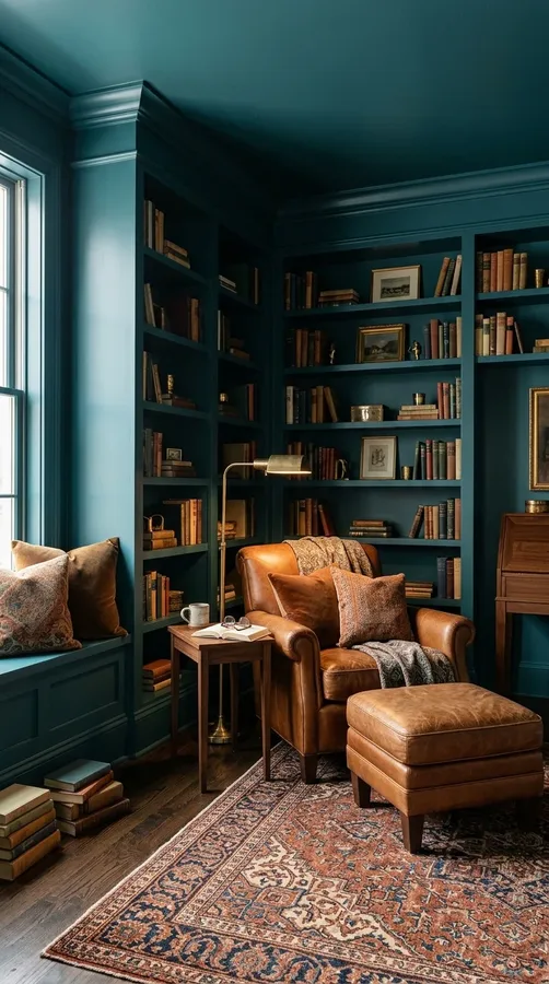
12. Teal Colour Drenched Reading Room
A deep teal reading room creates a wonderfully atmospheric retreat for quiet afternoons and relaxing evenings. Apply the colour to every major surface, including the ceiling, walls, trim and built-in shelving, to make the room feel cohesive and immersive. Teal works beautifully with cognac leather armchairs, walnut bookcases and aged brass reading lamps. Add a patterned rug, comfortable cushions and a small side table to make the space practical as well as attractive. For extra depth, choose a teal with blue-green undertones that changes subtly as the lighting shifts. This approach is particularly effective in smaller rooms where a dramatic, enclosed atmosphere feels intentional.
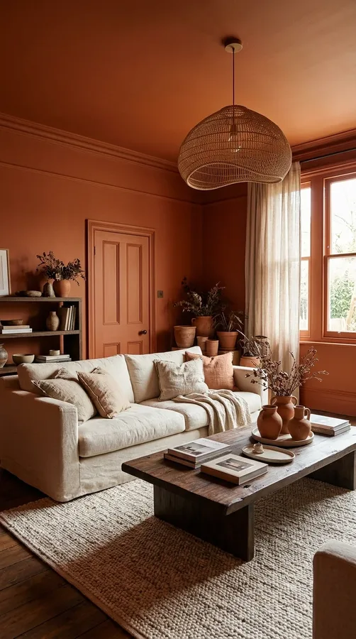
13. Rust Orange Colour Drenched Living Room
Rust orange brings warmth, energy and a welcoming character to contemporary living spaces. Choose a muted burnt-orange shade and extend it across the walls, ceiling, door frames and skirting boards. This earthy colour pairs naturally with cream sofas, dark timber furniture, woven pendant lights and natural linen. Introduce terracotta pottery and patterned cushions to build a layered, collected appearance. If you want a slightly more sophisticated look, choose a rust shade with brown undertones rather than a bright orange. Colour drenching makes this bold palette feel more balanced because every architectural surface contributes to the overall design instead of competing for attention.
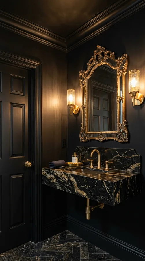
14. Black Colour Drenched Powder Room
A black colour-drenched powder room is a bold decorating choice that can look incredibly sophisticated when thoughtfully planned. Paint the walls, ceiling, doors and trim in a rich black or softened charcoal shade to create a dramatic jewel-box effect. Introduce a statement mirror, polished brass taps and warm wall sconces for an elegant finish. A marble basin or natural stone countertop adds visual variation without disrupting the monochromatic palette. In a small powder room, reflective surfaces and carefully positioned lighting are especially important. Consider a washable finish for high-touch areas and make sure the room has adequate illumination so the dark colour feels luxurious rather than uncomfortable.
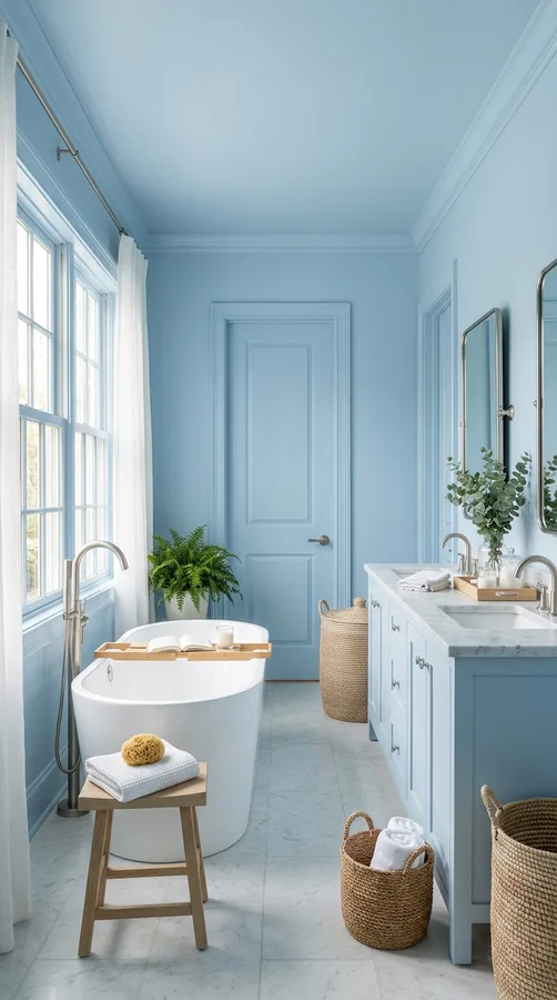
15. Pale Blue Colour Drenched Bathroom
Create a fresh, peaceful bathroom with a pale blue colour-drenched scheme. A soft powder blue across the walls, ceiling, doors and trim can make the space feel airy and coordinated. Pair it with white sanitaryware, brushed nickel fixtures and light marble surfaces for a clean, timeless appearance. Natural woven accessories and pale timber details introduce warmth, preventing the blue from feeling too cool. In bathrooms, select suitable moisture-resistant paint for surfaces that are not tiled and ensure ventilation is adequate. A slightly greyed blue is often easier to decorate with than a very bright pastel shade, especially when you want a relaxing, spa-inspired atmosphere.
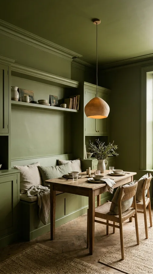
16. Olive Green Colour Drenched Dining Nook
Olive green is a wonderful choice for a dining nook that feels earthy, cosy and full of personality. Use the same olive shade on the walls, ceiling, trim and any surrounding built-in cabinetry to create a connected appearance. A wooden dining table, woven chairs and linen seat cushions complement the colour naturally. Add a pendant light with a warm finish and a few ceramic accessories to make the area feel welcoming. Olive green also works well with aged brass, cream and muted terracotta. If the nook is part of an open-plan kitchen, repeating the shade in nearby decorative details can help connect the two areas without making the entire home feel overly coordinated.
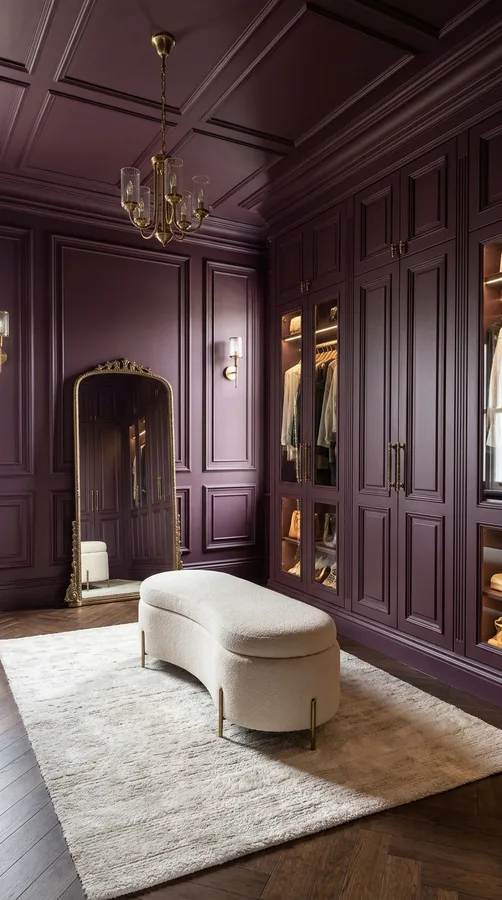
17. Plum Colour Drenched Dressing Room
Give a dressing room a boutique-inspired appearance with a rich plum colour scheme. Paint the walls, ceiling, trim and wardrobe surrounds in a deep plum or muted aubergine shade to create a sophisticated setting for clothing and accessories. Add full-length mirrors, warm brass handles and elegant lighting to enhance the luxurious atmosphere. Cream upholstered seating and a soft rug can introduce contrast while keeping the space comfortable. If you have open shelving, painting the shelves in the same colour will help create a beautifully integrated look. For smaller dressing rooms, choose a slightly lighter plum and use mirror placement to make the space feel more open.
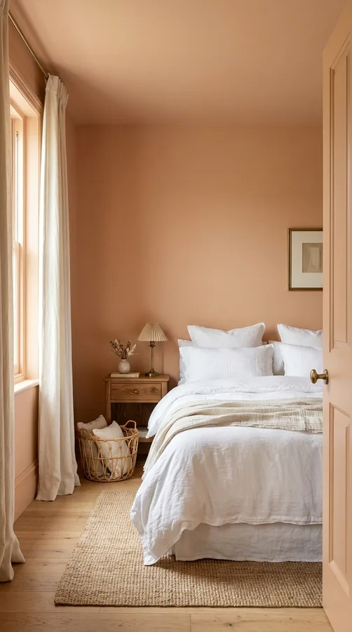
18. Muted Peach Colour Drenched Guest Room
A muted peach colour scheme can make a guest bedroom feel warm, welcoming and thoughtfully decorated. Choose a soft peach shade with beige undertones and apply it to the walls, ceiling, doors and trim. This creates a gentle backdrop that feels more distinctive than a standard neutral bedroom. Combine the colour with crisp white bedding, natural oak bedside tables and cream curtains. Small touches of antique brass or woven accessories add warmth without introducing too many competing finishes. Peach also looks beautiful with muted sage green accents, making it easy to introduce a few cushions or decorative objects for additional depth while keeping the overall atmosphere relaxed.
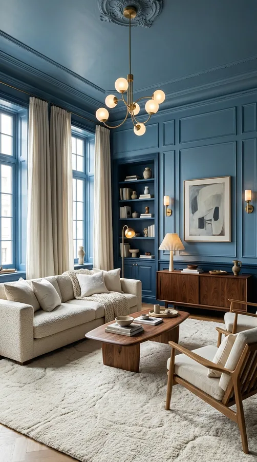
19. Monochromatic Blue Colour Drenched Room
For a creative interpretation of colour drenching, experiment with different shades of the same blue family. Use a medium blue on the walls, a slightly deeper blue on the trim and a complementary shade on the ceiling to create a layered monochromatic effect. Although the tones differ, keeping them within the same colour family helps maintain a cohesive appearance. This technique works beautifully in bedrooms, living rooms and creative home offices. Introduce natural wood, soft cream textiles and brushed metal accents to prevent the palette from feeling too uniform. Test the shades together under both daylight and evening lighting before committing to the final combination.
How to Choose the Right Colour for a Colour-Drenched Room
Choosing the right colour is the most important part of a successful colour-drenching project. Start by considering the room’s purpose, natural light, existing furniture and the atmosphere you want to create. Deep greens, burgundy and chocolate brown are excellent for intimate spaces, while soft sage, cream and pale blue can create a lighter, more relaxed appearance. Always test paint samples on different walls and observe them throughout the day because lighting can significantly change how a shade looks. Think about the undertones of your flooring, furniture and fabrics as well. A colour that complements these existing elements will usually create a more harmonious result than one chosen in isolation.
Tips for Making Colour Drenching Work in Your Home
Before starting, plan which surfaces will receive the chosen colour. A traditional colour-drenched room usually includes walls, ceilings, skirting boards, architraves, doors and other visible architectural details. Use suitable paint finishes for each surface, such as durable finishes for doors and trim and washable finishes for busy walls. Preparation is equally important: clean surfaces, repair imperfections, sand where necessary and apply the appropriate primer. Consider these additional decorating tips:
- Balance bold colours: Introduce natural wood, stone and soft textiles to add visual warmth.
- Use lighting strategically: Combine overhead lighting with wall sconces, floor lamps and table lamps.
- Experiment with finishes: Matte, eggshell and satin finishes can create subtle variation while maintaining one colour.
- Consider the ceiling: Painting it in the same shade can make a room feel more immersive and cohesive.
- Test before committing: Check paint samples in morning, afternoon and evening light.
Conclusion
Colour drenching is a creative way to give your home a cohesive, stylish and memorable appearance. Whether you prefer the richness of burgundy, the calmness of sage green, the warmth of terracotta or the simplicity of creamy neutrals, extending colour across walls, ceilings and trim can completely transform a room. The best results come from choosing shades that complement your lighting, furniture and personal decorating style. Remember that texture, carefully selected accessories and layered lighting are just as important as the paint colour itself. Use these 19 colour drenched room ideas as inspiration to experiment with your favourite shades and create a home that feels beautifully connected from floor to ceiling.
Leave a Reply